Plot Combinatorial EDX Data
This guide shows you how to visualize composition data across your entire combinatorial library by combining EDX measurements from multiple quarters into unified plots.
Overview
After measuring EDX on your cleaved library quarters, you can create visualizations showing:
- Full composition gradients across the original library
- Ternary or quaternary composition maps
- Position-resolved elemental distributions
- Interactive plots for exploring composition space
This is accomplished using Jupyter Analysis with pre-built templates.
Prerequisites
Before creating visualizations, you need:
- Completed sputtering upload with combinatorial libraries
- EDX measurements uploaded for quarters you want to visualize
- Minimum: 1 quarter (for single-quarter visualization)
- Recommended: All 4 quarters (for full library reconstruction)
- Basic familiarity with the library positions (BL, BR, FL, FR)
Data Quality
Clean invalid EDX data points before creating plots. Bad data points will appear in your visualizations!
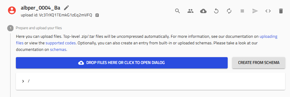
Step 1: Navigate to Your Upload
Go to the sputtering upload containing your combinatorial libraries and EDX measurements.
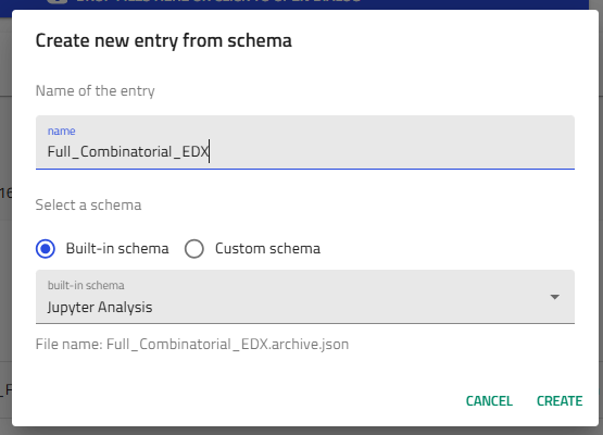
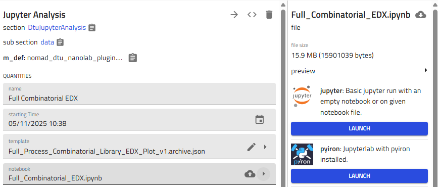
Step 2: Create Jupyter Analysis Entry
2.1 Start Schema Creation
Click "Create from schema" in your upload.
2.2 Select Jupyter Analysis
-
Entry name: Choose a descriptive name
Example:amazingresearcher_0042_CuZn_EDX_Full_Library -
Schema: Select "Jupyter Analysis" from built-in schemas
-
Click "Create"
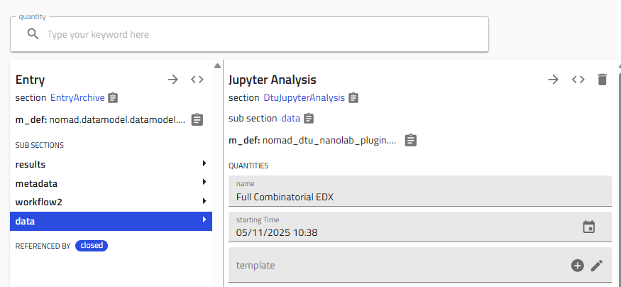
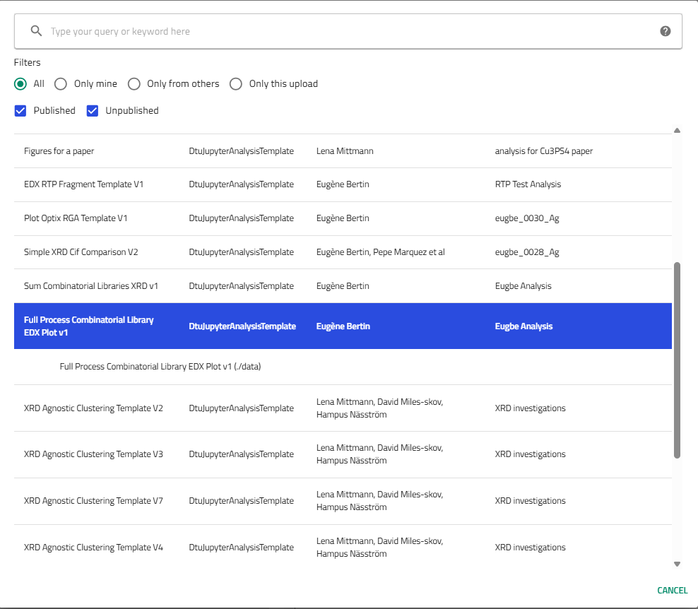
Step 3: Select Template
3.1 Choose the EDX Plotting Template
NOMAD provides pre-built templates for common analysis tasks.
In the template dropdown, select:
"Full Process Combinatorial Library EDX Plot v1 (By Eugène)"
This template automatically:
- Combines data from multiple quarters
- Reconstructs the full library geometry
- Creates composition maps
- Generates interactive plots
Template Benefits
Templates save time by providing tested, working code. You can modify the generated notebook later for custom analysis.
Step 4: Link Combinatorial Libraries
4.1 Navigate to Libraries Section
Scroll down to the "Libraries" section in the Jupyter Analysis entry.
4.2 Add Library References
You need to link the combinatorial library entries (not the EDX measurement entries).
For each quarter you measured:
-
Click the "+" icon next to "Libraries" to add a library reference
-
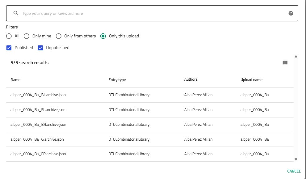
A selector appears - search for your library
-
Select the combinatorial library with the appropriate position suffix:
username_####_Material_BL(back left)username_####_Material_BR(back right)username_####_Material_FL(front left)username_####_Material_FR(front right)
Finding Libraries Quickly
- Use the "Only this upload" filter to show only your libraries
- Type part of thename to search
- Libraries are named with position suffixes matching your quarters
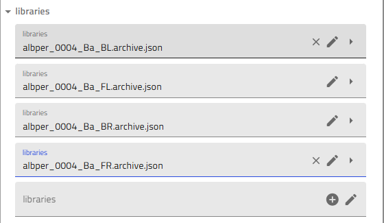
4.3 Add All Four Quarters
Repeat the process to add all four libraries (or however many you measured):
Partial Libraries
If you only measured some quarters, add only those. The visualization will show the measured regions.
Step 5: Generate the Notebook
5.1 Activate Generation
Scroll back up to the top of the Jupyter Analysis entry.
Find the "Generate notebook" toggle and activate it (turn it on).
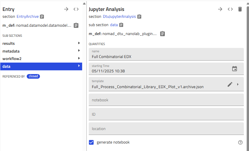
5.2 Save to Trigger Generation
Click "Save" at the top of the page.
NOMAD will:
- Validate your library selections
- Fetch EDX data from the linked quarters
- Generate a Jupyter notebook using the template
- Populate it with your specific data
Processing Time
Notebook generation typically takes 30-60 seconds. You'll see the notebook appear after processing completes.
Step 6: Launch and Run the Notebook
6.1 Access the Notebook
After generation completes, you'll see a notebook tab appear in the entry.
Click on the notebook name or the arrow icon to the right to open it.
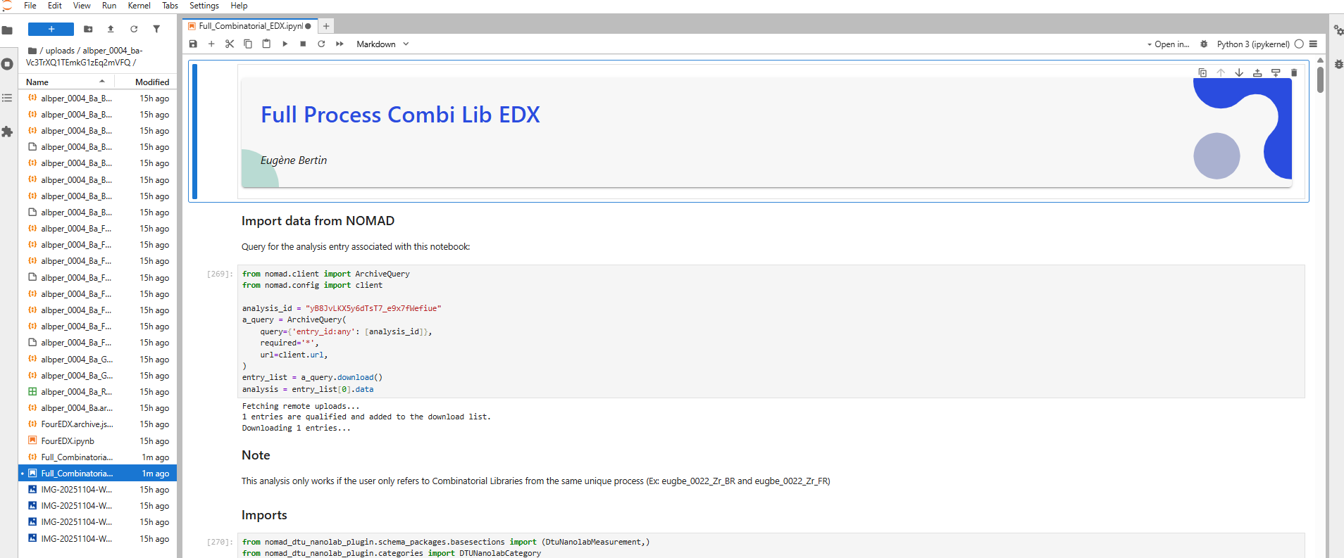
6.2 Launch Jupyter
The notebook opens in Jupyter, NOMAD's interactive computation environment.
If prompted, select the Python kernel.
6.3 Run All Cells
To generate your plots:
-
Click "Run All" in the Jupyter menu, or
-
Run each cell sequentially using Shift+Enter
The notebook will:
- Load EDX data from all linked quarters
- Combine them into full library coordinates
- Generate composition maps
- Create interactive visualizations
- Display statistical summaries
Plots Generated!
You should now see composition maps, ternary diagrams, or other visualizations depending on your material system.
Understanding the Plots
Typical Visualizations
The template generates several plot types:
Composition Maps
- 2D color maps showing elemental distributions
- X and Y axes represent position on the library
- Color intensity represents composition (atomic % or weight %)
Ternary Diagrams (for 3-element systems)
- Triangular plots showing three-component compositions
- Each point represents a measurement location
- Useful for identifying phase boundaries
Line Scans
- Composition profiles along specific directions
- Shows gradient steepness and composition ranges
Interactive Plots
- Hover to see exact compositions
- Zoom and pan to explore details
- Export as images for presentations
Interpreting Gradients
Your plots reveal:
- Composition range achieved - What compositions exist in your library
- Gradient direction - How composition varies spatially
- Target effectiveness - How well targets created intended gradients
- Regions of interest - Where interesting compositions are located
Customizing the Notebook
Modifying Parameters
The template notebook contains code cells you can modify:
- Color maps: Change visualization colors
- Plot ranges: Adjust axis limits
- Elements displayed: Select which elements to plot
- Resolution: Change interpolation or gridding
Adding Analysis
You can add new cells to:
- Calculate derived quantities (ratios, gradients, etc.)
- Correlate with other measurements (XRD, optical, etc.)
- Statistical analysis
- Machine learning predictions
Learn by Example
Review notebooks from colleagues to see what analyses are possible. Copy useful code cells into your notebook.
Exporting Results
Saving Plots
To save high-quality figures for publications:
See the Export High-Quality Figures guide for detailed instructions on:
- Setting DPI and resolution
- Choosing vector (SVG) vs. raster (PNG) formats
- Configuring Plotly export options
Sharing Analysis
Your Jupyter Analysis entry is part of your upload, so:
- Collaborators with access to the upload can view your notebook
- Plots appear in the entry view
- Notebook can be re-run to regenerate plots after data updates
Troubleshooting
Notebook doesn't generate
Problem: "Generate notebook" toggle doesn't create a notebook
Solutions:
- Verify all four library fields are filled (or expected number)
- Check that libraries exist and are accessible
- Ensure template is selected
- Try saving again after a moment
- Refresh the page and check if notebook appeared
No data appears in plots
Problem: Plots are empty or show no data points
Solutions:
- Verify EDX measurements exist for the linked quarters
- Check that EDX entries have data in "Results" sections
- Ensure EDX measurements link to the correct quarters
- Confirm library names match between EDX and libraries added here
Plots show gaps or missing quarters
Problem: Only some quarters appear in visualizations
Solutions:
- Verify you added all four libraries (if you measured all four)
- Check that EDX data exists for missing quarters
- Ensure quarter names are consistent (BL, BR, FL, FR)
- Review EDX entries for the missing quarters
Jupyter is stuck on "Launching"
Problem: Jupyter interface doesn't load
Solutions:
See the Troubleshoot Jupyter guide for detailed solutions.
Quick fix:
- Wait 2-3 minutes (initial launch can be slow)
- Refresh the page
- Check server status with NOMAD support
Error running notebook cells
Problem: Code cells show errors when executed
Solutions:
- Check if required Python packages are installed
- Verify data format matches expected structure
- Read error messages carefully - they often indicate the issue
- Ask colleagues if they encountered similar errors
- Contact the template author (check notebook comments)
Next Steps
After visualizing your EDX data:
- Identify compositions of interest for further study
- Correlate with other measurements:
- Overlay XRD phase maps
- Compare with optical properties
- Link to electrical measurements
- Prepare figures for presentations or publications
- Document findings in your lab notebook
- Share results with collaborators
Related Resources
- Add EDX Measurements - Upload EDX data
- Export High-Quality Figures - Save publication-ready plots
- Jupyter Analysis Reference - Advanced analysis techniques
- Combinatorial Libraries - Understanding the data model
Need Help?
If you encounter issues:
- Ask colleagues who have created similar plots
- Review example Jupyter Analysis entries in your group
- Check if your template version is up to date
- Contact the template maintainer (often listed in notebook)
- Reach out to DTU Nanolab NOMAD support